Skip to content

Squirrel Talk

Nutty Chitter from a Caffeinated Critter

Menu
  • Books
    • Niniers Series
    • Cera Chronicles
    • Anthologies
  • About Me
  • Privacy Policy
Menu

Cover Title Color Choice

Posted on October 17, 2014 by Loni Townsend

If you saw Wednesday’s post, you saw I was considering updating the title appearance on my cover. Most agreed that the metallic, beveled look made a greater impact. Aldrea suggested using a different color.

I’ve adjusted the lighting so it comes from the correct direction, and made the text fit the e-book size.

e-book-gold

e-book-green

Which color do you like better? Gold or Green?

And don’t forget, Thanmir War’s 99¢ sale ends tomorrow!

Tweets for your convenience. 😉

The Earth Clan has declared war and a landscaper is at the dead center of it. Thanmir War on sale for $0.99. http://ctt.ec/VbrBH+

Are you #reading? Thanmir War is on #sale for $0.99. http://ctt.ec/f7jb4+ #fantasy #book

Enjoy #fantasy? Pick up Thanmir War while it’s on sale for $0.99! http://ctt.ec/efz9U+

23 thoughts on “Cover Title Color Choice”

  1. Beth says:
    October 17, 2014 at 11:03 AM

    interesting…I like them both. The green appears more seamless …but then again the gold makes it pop. (I’m a very indecisive person, haha) I’d have to say the green.

    Reply
  2. Crystal Collier says:
    October 17, 2014 at 11:03 AM

    Definitely the gold.

    Reply
  3. Alex J. Cavanaugh says:
    October 17, 2014 at 12:13 PM

    First one – the brighter color makes the title pop off the cover.

    Reply
  4. Arlee Bird says:
    October 17, 2014 at 2:58 PM

    I agree that the gold is much more striking.

    Lee
    Tossing It Out

    Reply
  5. Southpaw says:
    October 17, 2014 at 3:17 PM

    This is a rough one ’cause both have a strong appeal. I like the continuity of the green, but the gold pops. I’m thinking about when it’s shrunk up and little for ebooks. The gold will stand out better. Even on a book shelf the gold would probably catch someone’s eye.

    Reply
  6. Lexa Cain says:
    October 17, 2014 at 3:22 PM

    The green brings to mind dark, creepy things. The gold looks more fantastical, like enchanted swords and castles. So it’s up to you which way you want to present your novel — dark or light. Good luck! 🙂

    Reply
  7. Loni Townsend says:
    October 17, 2014 at 4:11 PM

    Across the different social networks, gold is winning!

    Reply
    1. Aldrea Alien says:
      October 18, 2014 at 2:35 AM

      I knew it would. ^_^

      Reply
  8. L.G. Smith says:
    October 17, 2014 at 6:06 PM

    Yeah, I’m really bad at this stuff. I like them both. I’d never be able to choose a cover on my own.

    Reply
  9. Christine Rains says:
    October 17, 2014 at 7:24 PM

    This is a difficult choice. The gold does stand out, but the green seems more harmonious. If that makes sense! =P

    Reply
  10. Stephanie Faris says:
    October 18, 2014 at 6:14 AM

    The gold definitely pops more!!! The second cover does have a little more harmony, if that makes sense. I think because everything blends. Both look treat–it’s just whether you want the title to jump out at readers or not when they’re looking at your cover.

    Reply
  11. Leandra Wallace says:
    October 18, 2014 at 3:29 PM

    I vote gold! 🙂

    Reply
  12. Milo James Fowler says:
    October 19, 2014 at 7:27 AM

    I’m liking the gold, but then I think your name should match — even if only by a shade or two. Balance and all that. What do you think of extending WAR the full width of THANMIR?

    Reply
  13. Carrie Butler says:
    October 19, 2014 at 11:03 PM

    I would definitely go with the gold for contrast and a dark, semitransparent gradient behind it for pop. As Milo mentioned, I would have your name match—sans beveling. 🙂

    Reply
  14. Lori L MacLaughlin says:
    October 20, 2014 at 6:16 AM

    I like the gold best of these two but wonder what it would look like with a brighter green. The pale green doesn’t stand out as much.

    Reply
    1. Loni Townsend says:
      October 20, 2014 at 8:45 AM

      Actually, I did make a bright green, but I didn’t like it as much. Bright Green

      Reply
  15. Jay Noel says:
    October 20, 2014 at 12:10 PM

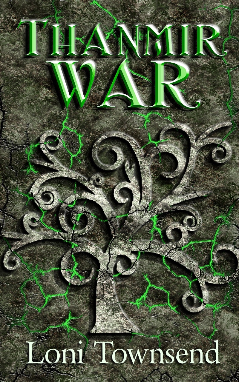
    Go with the gold. It’s got more contrast with the gray background.

    Reply
  16. Maurice Mitchell says:
    October 20, 2014 at 2:03 PM

    The color in the first cover pops. I like it.

    Reply
  17. Sarah Brentyn says:
    October 20, 2014 at 2:59 PM

    I immediately thought “gold” but, when I clicked on the covers and saw them more closely, I liked them both. The green blended better and the gorgeous metallic tree stood out. So…have you decided?

    Sorry. No help. :-\

    Reply
    1. Sarah Brentyn says:
      October 20, 2014 at 3:00 PM

      What’s wrong with the bright green? You didn’t like that one?

      Reply
      1. Loni Townsend says:
        October 20, 2014 at 3:34 PM

        It was too much green for me. I felt smothered in it.

        Reply
  18. cleemckenzie says:
    October 20, 2014 at 3:31 PM

    I’m wondering the significance behind the vine. Is it a sign of hope and new growth? Then I like the green. Is there avarice involved in the story? Then the gold.

    Reply
  19. The Happy Whisk says:
    October 21, 2014 at 9:49 PM

    Thanks for dropping by today. Hope you find a colour you like best. What are the green bolty bits for?

    Reply

Leave a Reply Cancel reply

Your email address will not be published. Required fields are marked *

This site uses Akismet to reduce spam. Learn how your comment data is processed.

Welcome to my blog. I post here on Wednesdays most of the time, but you can find me on social media any day of the week. My topics include my stories and writing, life at the Town's End, creating and tinkering with graphics, things I learn and think might be helpful to others, and the occasional amateur photo. Thanks for stopping by! I hope to see you around.

Get Social!

Follow Me on FacebookFollow Me on TwitterFollow Me on FlickrFollow Me on InstagramFollow Me on PinterestFollow Me on RSSFollow Me on GoodreadsEmail Me!Follow Me on DeviantArt

Recent Posts

  • Keep On Marching On #IWSG
  • Got You Covered #IWSG
  • Welcome 2023! #IWSG
  • Progress Made #IWSG
  • No NaNo for Me #IWSG

By clicking submit, you agree to share your email address with me and Mailchimp to receive my blog posts via emails. Don't worry, I only post about once a month. Use the unsubscribe link in the email to opt out at any time.

Processing…
Success! You're on the list.
Whoops! There was an error and we couldn't process your subscription. Please reload the page and try again.

Categories

Books and Anthologies

© 2023 Squirrel Talk | Powered by Superbs Personal Blog theme